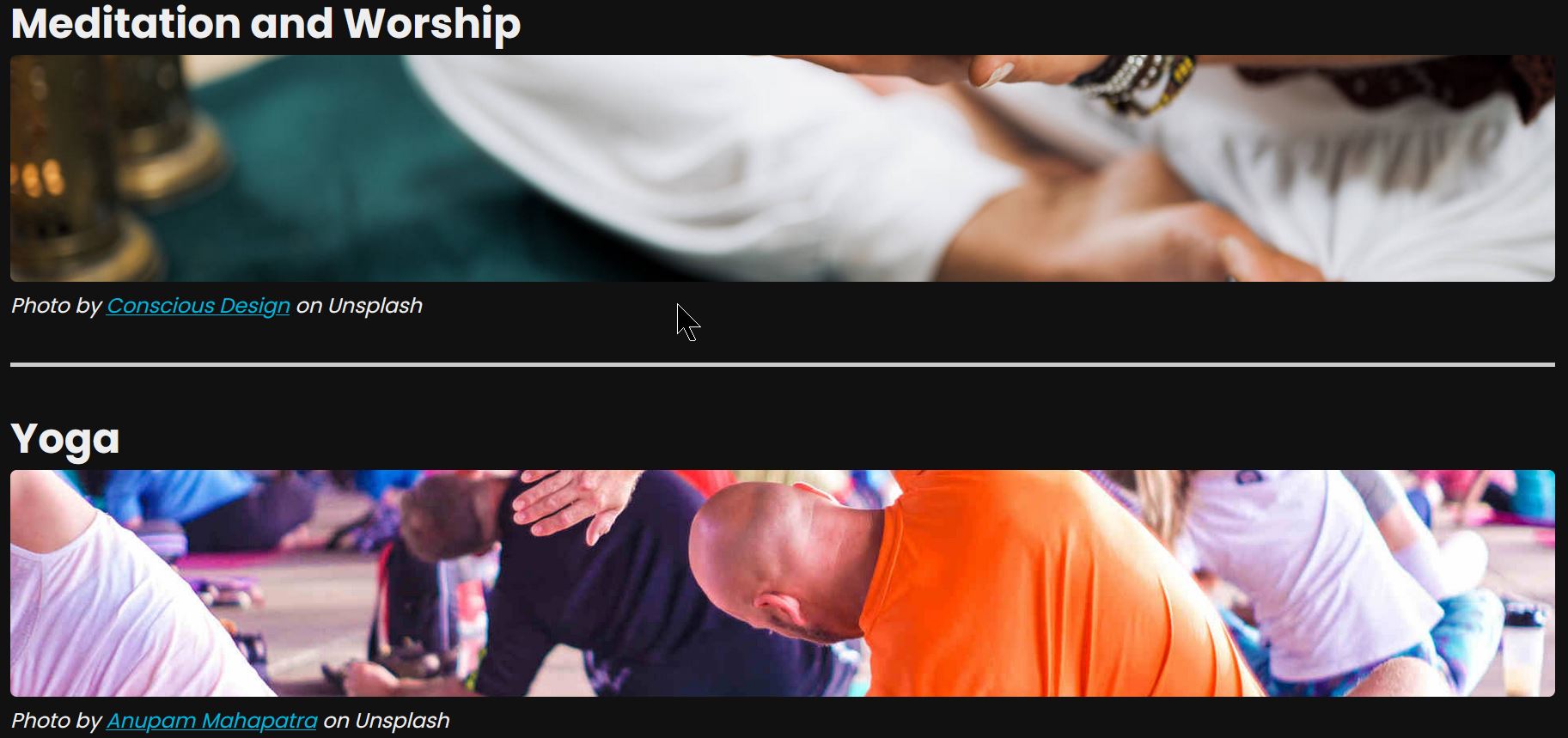
Fixed height images and object-fit: cover

Here is my favorite CSS trick so far, learnt from the Creative React and Redux course by developedbyed.
It is a way to create fixed height image blocks which scale depending on the view height without appearing skewed.
Let’s dive into it.
Box Sizing⌗
By default, CSS will add border, margin, and padding onto the height and width properties: this is called content-box box-sizing. This is somewhat annoying to deal with, as it can make child elements overflow their parent elements easily.
The other option is border-box box-sizing. Border, margin, and padding will be added (or subtracted) from the width and height without overflowing the containing element.
border-box is most useful for layouts. content-box might be useful when you need to position something absolutely.
Height relative to the view height⌗
height: 30vh;
This rule indicates that the image should stretch or shrink depending on the view height of the device to fill 30% of the visible screen, regardless of zoom level.
Maximum Width⌗
width: 100%
Setting the width of image to 100% will always stretch to fill 100% of the width relative to its parent container.
Object Fit Cover⌗
This final property is the magic: setting a fixed height and a full width means that the image may appear distorted if it does not match this aspect ratio. To avoid this, object-fit: cover is used. This will maintain aspect ratio while sizing the image down to fill the entire content box, and it will be cropped to fit the space if the aspect ratio of the box (100% x 30vh) does not match the aspect ratio of the image.
Source: developer.mozilla.org
This was the first time I had ever seen this trick in use, so I thought it was worth sharing. Thanks for reading!